

Community post
怎么使用markdownplus画线图/How to use markdownplus to create a line chart
Summary:
Markdown-plus is a markdown editor, but it also can help us to create charts . Today i will show you how to use markdownplus to create line chart.
Markdown-plus从名字看是markdown的升级版,不仅仅可以让我们用md语法写文章,同时支持让我们创建图表,今天我介绍如何使用markdown-plus 创建连线图。
因为markdown-plus扩展支持了chart.js,所以我们只需要执行简短的代码就可以绘制精美的统计图,而不需要去学习太多chart.js的知识。
What Will I Learn?/教程知识点
- Markdown语法格式输入,以及如何支持扩展语言
- 声明连线图
- 设置X轴标签名称
- 设置连线图外观
- 录入数据
Requirements/要求
- 简单英文基础
- 简单markdown语法基础
- 下载markdown-plus编辑器
Difficulty/难度
简单
Tutorial Contents/教程内容
下面先看一个简单例子:
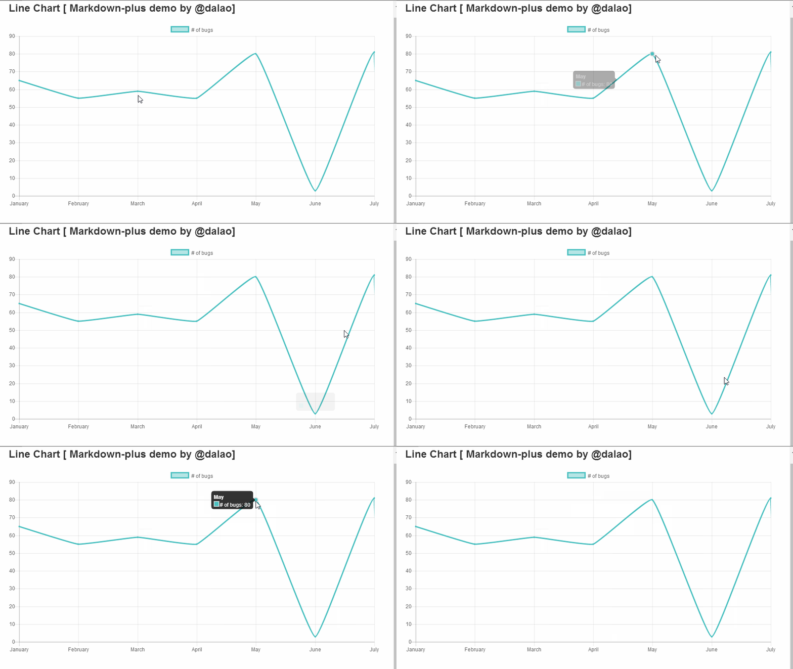
演示代码如下:
{
  "type": "line",
  "data": {
    "labels": [
      "January",
      "February",
      "March",
      "April",
      "May",
      "June",
      "July"
    ],
    "datasets": [
      {
        "label": "# of bugs",
        "fill": false,
        "lineTension": 0.1,
        "backgroundColor": "rgba(75,192,192,0.4)",
        "borderColor": "rgba(75,192,192,1)",
        "borderCapStyle": "butt",
        "borderDash": [],
        "borderDashOffset": 0,
        "borderJoinStyle": "miter",
        "pointBorderColor": "rgba(75,192,192,1)",
        "pointBackgroundColor": "#fff",
        "pointBorderWidth": 1,
        "pointHoverRadius": 5,
        "pointHoverBackgroundColor": "rgba(75,192,192,1)",
        "pointHoverBorderColor": "rgba(220,220,220,1)",
        "pointHoverBorderWidth": 2,
        "pointRadius": 1,
        "pointHitRadius": 10,
        "data": [
          65,55,
          59,55,
          80,3,
          81,3,
          56,4,
          55.5,
          40
        ],
        "spanGaps": false
              }
    ]
  },
  "options": {}
}
知识点1:Markdown语法格式输入,以及如何支持扩展语言
markdown 里面代码是使用 英文状态下的4个顿号括起来的,如下:
····
代码  //此时,这部分内容是不被执行的,在markdown会直接显示出来。
····
效果是代码高亮,区别于别的内容。
想要实现进度图,markdown语法是不支持的,而markdown-plus支持语法扩展,所以我们可以在markdown-plus输入别的语法来实现我们需要的功能。
····chart
代码区域
····
这里我们使用扩展语法 chart来制作进度图图,此时,代码区域的内容会被执行。
知识点2:声明连线图
"type": "line",
type为图表类型,line即为连线图。
知识点3:设置X轴标签名称
"data": {
    "labels": [
      "January",
      "February",
      "March",
      "April",
      "May",
      "June",
      "July"
    ],
labels即为标签,这里设置的是显示在X轴上面的各个标签名称。用双引号括起来,用逗号隔开。例子如下:

知识点4:设置连线图外观
"datasets": [
      {
        "label": "# of bugs",
        "fill": false,
        "lineTension": 0.1,
        "backgroundColor": "rgba(75,192,192,0.4)",
        "borderColor": "rgba(75,192,192,1)",
        "borderCapStyle": "butt",
        "borderDash": [],
        "borderDashOffset": 0,
        "borderJoinStyle": "miter",
        "pointBorderColor": "rgba(75,192,192,1)",
        "pointBackgroundColor": "#fff",
        "pointBorderWidth": 1,
        "pointHoverRadius": 5,
        "pointHoverBackgroundColor": "rgba(75,192,192,1)",
        "pointHoverBorderColor": "rgba(220,220,220,1)",
        "pointHoverBorderWidth": 2,
        "pointRadius": 1,
        "pointHitRadius": 10,
       }
    ]
label 图例,显示在表格上方,如下:

其余参数介绍:
Line Configuration 线性设置
| Name | Type | Default | Description |
|---|---|---|---|
| tension | Number | 0.4 | 默认贝塞尔曲线张力设置,设置为0时,没有曲线张力 |
| backgroundColor | Color | 'rgba(0,0,0,0.1)' | 默认填充颜色 |
| borderWidth | Number | 3 | 线的宽度 |
| borderColor | Color | 'rgba(0,0,0,0.1)' | 默认线的颜色 |
| borderCapStyle | String | 'butt' | 默认线的一端的样式 |
| borderDash | Array | [] | 默认线条波折线样式 |
| borderDashOffset | Number | 0.0 | 默认波折线间距 |
| borderJoinStyle | String | 'miter' | 默认线波折连接样式 |
| capBezierPoints | Boolean | true | 如果值为true则控制图表内部点,为false则不控制 |
| fill | Boolean | true | 如果是true则为线填充颜色 |
| stepped | Boolean | false | 如果是true则线的样式是折线,张力会无效 |
Point Configuration点型设置
| Name | Type | Default | Description |
|---|---|---|---|
| radius | Number | 3 | 默认半径 |
| pointStyle | String | 'circle' | 默认样式 |
| backgroundColor | Color | 'rgba(0,0,0,0.1)' | 默认填充颜色 |
| borderWidth | Number | 1 | 默认边的宽度 |
| borderColor | Color | 'rgba(0,0,0,0.1)' | 默认边的颜色 |
| hitRadius | Number | 1 | 鼠标悬浮时额外增加的半径 |
| hoverRadius | Number | 4 | 鼠标放上去是的默认半径 |
| hoverBorderWidth | Number | 1 | 鼠标放上去时默认线宽 |
Rectangle Configuration矩形设置
| Name | Type | Default | Description |
|---|---|---|---|
| backgroundColor | Color | 'rgba(0,0,0,0.1)' | 默认条颜色 |
| borderWidth | Number | 0 | 默认条的线宽 |
| borderColor | Color | 'rgba(0,0,0,0.1)' | 默认条的线的颜色 |
| borderSkipped | String | 'bottom' | 默认的跳跃边界 |
知识点5:录入数据
"data": [
          65,
          59,
          80,
          80,
          50,
          55,
          40
        ],
此部分代码还是要写在dataset里,data:数据。格式 "data":{data1,data2,data3……}
x轴标签有多少个就录入多少个数据。
下面是个简单实例:
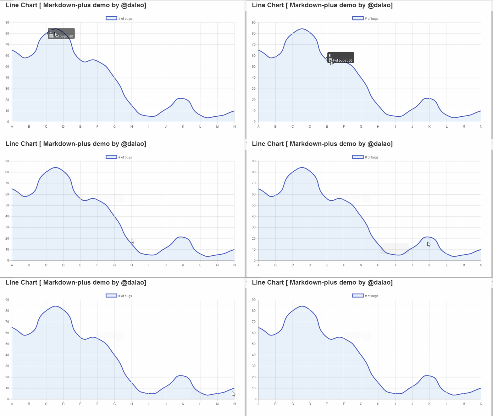
代码如下:
{
  "type": "line",
  "data": {
    "labels": [
      "A",
      "B",
      "C",
      "D",
      "E",
      "F",
      "G",
      "H",
      "I",
      "J",
      "K",
      "L",
      "M",
      "N"
    ],
    "datasets": [
      {
        "label": "# of bugs ",
        "fill": true,
        "lineTension": 0.6,
        "backgroundColor": "rgba(25,102,192,0.1)",
        "borderColor": "rgba(75,92,192,1)",
        "borderCapStyle": "butt",
        "borderDash": [],
        "borderDashOffset": 1,
        "borderJoinStyle": "miter",
        "pointBorderColor": "rgba(175,192,192,1)",
        "pointBackgroundColor": "#fff",
        "pointBorderWidth": 1,
        "pointHoverRadius": 5,
        "pointHoverBackgroundColor": "rgba(175,192,192,1)",
        "pointHoverBorderColor": "rgba(225,225,220,1)",
        "pointHoverBorderWidth": 2,
        "pointRadius": 1,
        "pointHitRadius": 11,
        "data": [
          65,
          59,
          80,
          81,
          56,
          55,
          40,
          15,
          5,
          11.3,
          21,
          6,
          5,
          10
        ],
        "spanGaps": false
      }
    ]
  },
  "options": {}
}
Curriculum/系列课程
- 怎么使用markdownplus画流程图/How to use markdownplus to create a flow chart
- 怎么使用markdownplus画工作进度图/How to use markdownplus to create work schedule
- 怎么使用markdownplus画时序图/How to use markdownplus to create relation diagram
Posted on Utopian.io - Rewarding Open Source Contributors
Replies (3)
Your contribution cannot be approved because it does not refer to or relate to an open-source repository. See here for a definition of "open-source."
Explanation:
@scipio
You can contact us on Discord.
[utopian-moderator]
Congratulations @dalao! You have received a personal award!
Click on the badge to view your Board of Honor.
Do not miss the last post from @steemitboard!
Participate in the SteemitBoard World Cup Contest!
Collect World Cup badges and win free SBD
Support the Gold Sponsors of the contest: @good-karma and @lukestokes
Congratulations @dalao! You received a personal award!
You can view your badges on your Steem Board and compare to others on the Steem Ranking
Vote for @Steemitboard as a witness to get one more award and increased upvotes!