

Community post
Logo for GolDarah
Repository
https://github.com/ybreza/GolDarah

Details
This application is one of the artificial intelligence applications that have been made by myself, that is useful to Describe the features and human nature, the ability of this application is to provide a quetioner which every step is done from the questions that have been input in the previous system. This application runs using a decision tree algorithm that will provide convenience for the users in determining the blood according to the characters it has,
I decided to make a logo because this app does not have a logo yet, as I know the contribution to the project itself is okay, as long as it keeps up with the existing rules. I created an issue on github and put the logo into my own project.
Presentation

Benefits / Improvements
The benefits of this logo are derived from my own, which is an application of artificial intelligence that serves to determine the blood type. In other words this application is a medical application, I made a logo with a blood form, but I use the blue as a lightening of the logo, and represents the medical word I mentioned above
On Website

Proof of Work

Tools
I Used AI (Adobe Illustrator)
and AP (Adobe Photoshop)
Copyright
Image on Presentation
Here
Montserrat Font
here
Original files
Google Drive here
Issue here
My Github Account here
PR here
My Project Website here
Licence

This work is licensed under a Creative Commons Attribution 4.0 International License.
Replies (8)
really you have done amazing work :) m reading your content ,its amazing :) @ydreza
Hello!!! Nice logo :)
I don't know why people do this, but I have seen many making the same mistake:
Your logo looks perfect without the square!

Those squares with round corners are recommended only for the icons (android, playstore, or other ICON uses) for the logo itself it's not necessary and it's actually wrong.
Here is very low contrast:

Did you try the white one? and make the background a bit darker if necessary. And withouth the square, I am sure it will look much better!
Rough sample:
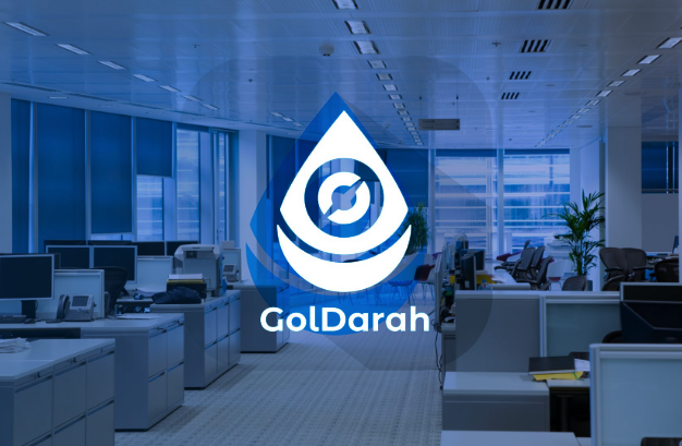
In general, your logo is really cool, just the applications of it are a bit incorrect.
< That is so fun! I have to talk to myself in github too when I create my logos or other stuff for my projects xD
Greetings!
I am not utopian moderator, take my advice if you want. I am a graphic designer graduated in 2009; founder of @wearecodex team.
OMG @fabiyamada, this is really a constructive comment!
I Love your statement, I admit I'm inexperienced, I'll welcome your comments with my pleasure
LOVE FABIYAMADA
You're welcome! Even with your lack of experienced you did very good :D
Hey @fabiyamada
Here's a tip for your valuable feedback! @Utopian-io loves and incentivises informative comments.
Contributing on Utopian
Learn how to contribute on our website.
Want to chat? Join us on Discord https://discord.gg/h52nFrV.
Vote for Utopian Witness!
This project doesnt seem to be actively developed or serious. It doesnt work and doesnt make any sense.
"The contribution should not contain any clear attempt to profit solely from a commercial perspective, and should not be written in a way that suggests the contributor is looking to maximise the returns."
Need help? Write a ticket on https://support.utopian.io/.
Chat with us on Discord.
[utopian-moderator]
I'm accepted your decision ;)
However, if someday someone else experiences something like me, do not ignore them for too long. Tell the truth, they are waiting for the exact certainty.